Love, Lydia - Notes from a geeky, plus sized artist.: tutorials
Showing posts with label tutorials. Show all posts

Tuesday, September 29, 2015

Beginning to Decorate

Hello everyone,

I've spent some of my weekend working on my studio.  It's finally starting to feel like my own space as I put things in their place and nail up various shelves and planning tools.  At the new house Bryan and I will have a shared workspace in our second story "rec room".  The space is a great size for an extra large office that will accommodate our three desks, all my art storage needs and incorporate a little lounge area.  Our end goal is using the upstairs space more for our down time needs, so we can keep our downstairs spaces cleaner since they're more public.  For now there are still a enough boxes left to be unpacked that it's hard to get a good picture of the room.

So now I'm feeling good about how our space is coming along.  Here are a couple shots of my corner.  I still have more to put on the walls and supplies to sort out, but it's coming along nicely.


This picture is from Friday and over the weekend I completed a couple of small projects, which are going to enhance my work corner even more.

Splatter Painted Paper Honeycomb Balls


First off I got a pack of these tissue paper honeycomb balls◊ and decided to DIY a splatter paint job on one with watercolor.  I think the first try looks ok, and I'm going to do another with acrylic paints to see if it works better or just ends up sticking the paper together too much.


Here are really easy instructions for how to do it.  First off you'll want newspaper to protect all surfaces near your project.  You probably need two sheets, I only used one in the image above because I'm lazy.  It makes for messes later though, and that's never worth it!


Next off pick your color scheme,  I decided to go with mostly cooler tones.  Here are my colors:
Winsor and Newton - Potter's Pink◊ (very delicate old rose color)
Winsor and Newton - Winsor Red◊ (probably the best true red watercolor I own!)
Winsor and Newton - Cobalt Turquoise Light◊ (this is one of my favorite shades!)
Cotman - Phtalo Blue [Green Shade]◊ (high staining color that's brilliant and good for the budget)
Holbein - Lavender◊ (this color is lovely though it contains some white, making it more opaque than true watercolor)
Holbein - Cobalt Violet Light◊ (a fantastic purple that's quite lightfast too)
Lukas - Gold◊ (a good color that looks a little funny in the palette, but dries down nicer)


Here's what they look like with water.


For this project most any brush will do, though it might get ruined if you're too vigorous.  For real brushes I loaded the brush with paint and flicked my wrist to move the paint.  The picture above gives you an idea of how much water was used VS paint.  It really only takes a little!  However I only mixed enough of each color to create the one honeycomb ball, so I wouldn't be wasteful.  Also for opening some of the tougher paint tubes I use a silicone jar opener!  It works wonders, and I've been given several over the years as freebies.


And here my first version is done.  It's more pastel, which I love, but you can use less water to get brighter results too.  I found that because the paper is easily saturated you can only use two colors at a time before letting everything you've done dry (about an hour and a half) before going on the the next colors.  This honeycomb has a string you can hang it from so you could paint it while it's hanging to be more neat, especially if you have a porch where you can set things up.  Sunshine would definitely speed up the drying process, my work was done on a rainy day, so it took longer to dry.  Then you just have to decide how you want to display them!

Refinished Shelf Cubes

A while back we got a set of shelf cubes for our bedroom, but we don't need them at the new house because I now have enough space for a bedside table rather than having the bed too close to a wall as I did at our old rental.  So I decided I could put the cubes up in my studio as extra storage for little inspirational items.  The cubes came in a set of three different sizes and though it looks like they might not carry the plain ones at Target anymore here are some similar ones from Amazon◊.

The ones I had were more matte in finish so I didn't even need to sand them, I just used two coats of custom mixed paint colors.  If you have shelves with a shinier finish rough them up a bit all over with a fine grit sandpaper before painting them so the paint will stick and not peel off.  I used Winsor and Newton Acrylics because I had a lot left over from college (Freshman year kits were required gear!), but you could use most any brand you want.  If you wanted to buy online you might want to give Utrecht Acrylics a try, they're a good deal for good quality paints. Some brands and colors may need more coats than others.  I added a good bit of white paint to all three of my chosen shades, which helps make them more opaque.

Here are my finished shelves!  I set them down to dry on newspaper after each coat, and held them on my hand to paint them.  If you want to paint them easier without having to hold them I recommend using a cork trivet or putting them on top of a cardboard box.  If you have drips it will stick to newspaper and might mean you have to touch up a little later, cardboard is less likely to run into this problem, and cork is free of it unless you have a bad enough drip that it just peels the paint off.


Mint, lavender, and dark blue are some of my favorite colors.  And finally here's a shot of my studio with the shelves and my watercolor reference chart set up.  It's still pretty crazy, but getting better every day.  I almost know where all my supplies are!


That's all for today.  Let me know what are some of your favorite colors to decorate with in the comments!  Thanks.

Love,
Lydia

Saturday, July 25, 2015

Fashion Friday

Hi everyone,

I'm out for the weekend to a family reunion, so this will be a shorter entry.  I'll have travel pictures and possibly some good stories when I return.

This week I have a couple of outfits to share with you all and a quick "How-to" for the method I use to dye my hair (with help from my husband).

I start off by using Beyond The Zone bleach on my hair.  It comes in a great kit that contains powder and a bottle of developer, gloves, a hair cap you can use to highlight or just protect your stuff from bleach/dye, plus a little highlighting wand and a brush for applying the bleach.  I always use this kit because it works incredibly well.  It takes 30-90 minutes depending on your hair, mine usually works at around an hour.  And this is the result:


I could wait for it to get more white blond, but I also run the danger of waiting too long and frying a bit of hair.  I've only had this happen once, and serendipitously it just gave me some cute bangs.  But it scared me enough to never wait too long again!

After the bleach process is washed out of your hair you have to it's fully dry before dying it.  The bleach makes hair dry, but the color I use by Manic Panic is a stain, so it can sit on hair for hours and not hurt a thing.  I find it actually moisturizes my hair really well as long as I leave it on for a couple hours.  This time I left the color on overnight, and put on the hair cap from the bleach kit to protect my pillow.  When I went to wash the dye out very little came out because it had soaked in so well.  As for the color I started by adding bits of After Midnight (blue) and Enchanted Forest (dark green) strategically where I wanted them to show best, then I put Atomic Turquoise on the rest.  Bryan helped me spot and fix places I couldn't see.  I'm blind without my glasses, so I'm very glad to have him helping me.  Here's what it looks like with the dye in my hair:


and then after it's washed out and complete:


Other than sometimes using a hairdryer to help the dye or bleach soak in better (use sparingly for the bleach unless you really know what you're doing), I don't really do anything fancy.

Anyway, now for the outfits:


The top is from Maurices, the jeans are skinnies from Torrid, the flip flips from Old Navy and the necklace was made by a fellow artist at the Crafty Cotillion Handmade Expo back in 2009.  I tried to track them down, but I couldn't find her site.  I love this piece though! 


This top is one I tried from Gwynnie Bee, I was going to wear it on the trip today, but at the last minute decided I really wasn't so into it, for several reasons - the fit and for comfort's sake.  So I switched to the top pictured below from Anthropologie instead, but brought the floral button down from Anthopologie in case I needed it, and kept the zip ankle jeans and converse sneakers too.


That's all for today, but I'll be back to talk about my garden Monday.  Till then do you readers have any suggestions for new ways I can try wearing what's in my wardrobe?

Love,
Lydia

Tuesday, October 28, 2014

Inkodyed Onesies

Hey friends!

So, over the last week I finally got to use the Inkodye that I received in my September Pigment + Palette box.  I'd been itching to use it from the start, but having trouble coming up with ideas for the magenta dye.  Then one of my best friends told me she was having a little girl, so I had the perfect excuse to use the dye!  I got some 100% cotton onesies, just the basic kind, nothing fancy.  And here's how I made the designs.

First off I looked at the instructions and ideas at http://lumi.co/guides/shadow knowing I'd want to try making shadow prints.  Inkodye works a lot like photographic emulsion, so I instinctively knew how I wanted to use the dye, but wanted to get it right the first time since the onesies were a gift.  Out of the 4 I made I think 3 were very successful and the 4th just so-so.  Tell me what you think:


So to make things like these I used some really simply methods and supplies other than the dye and Inkowash (a rinse that essentially removes the active agent in the dye making it light safe).  Things I used:
Painters tape (yep the kind for painting walls, one inch width)
Packing tape
Stencils
A round foam brush
A mini ironing board (any board or easy to move flat surface to lay items on while prepping and setting in the sun)
Some cardboard scraps (put inside the onesies to give a flat surface & prevent dye bleed through)
Scissors
Some old stickers I had
The onesies
A washing machine (hand washing would work too)

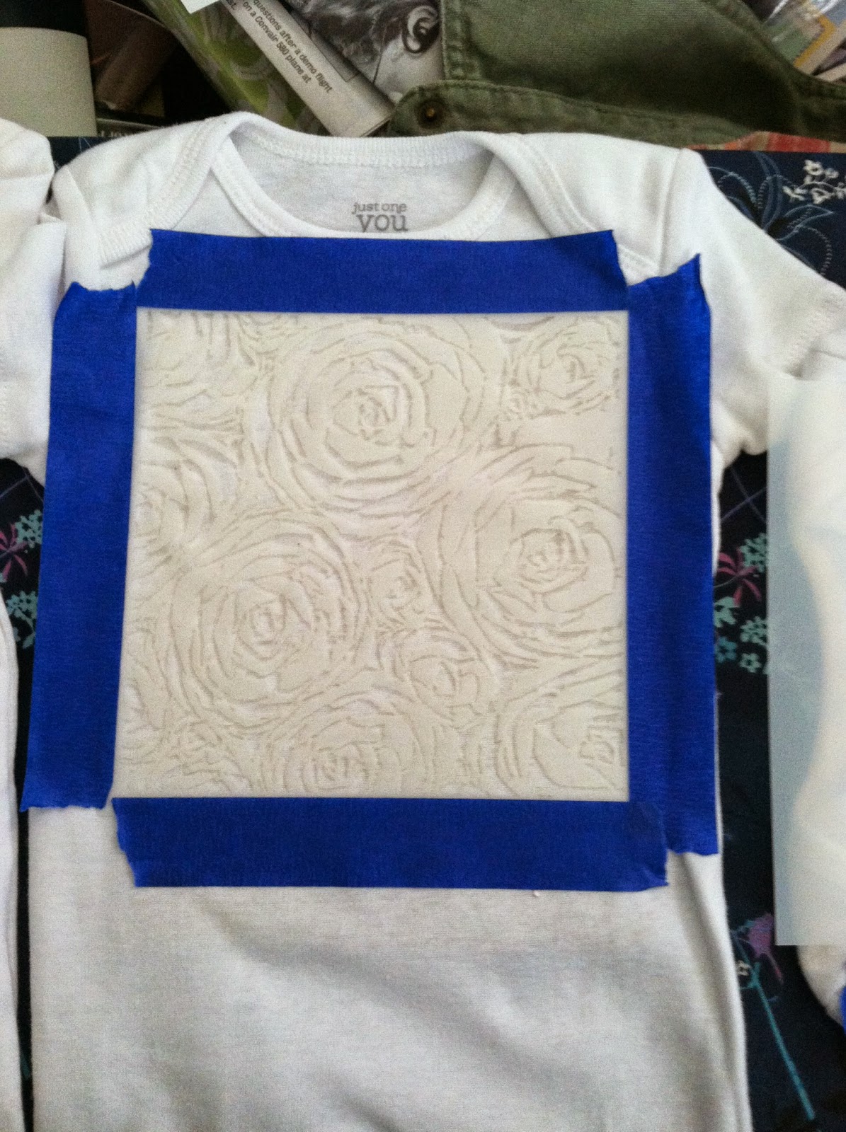
The instructions for shadow printing are basically this, put ink on the part of the shirt you want color, the block off the inked section with items that will become your design, or use something like a stencil to guide ink into just the areas you want it.  To facilitate this I used painters tape to tape down the stencils and used the round brush to put on the dye.  Here's a shot before the dye:


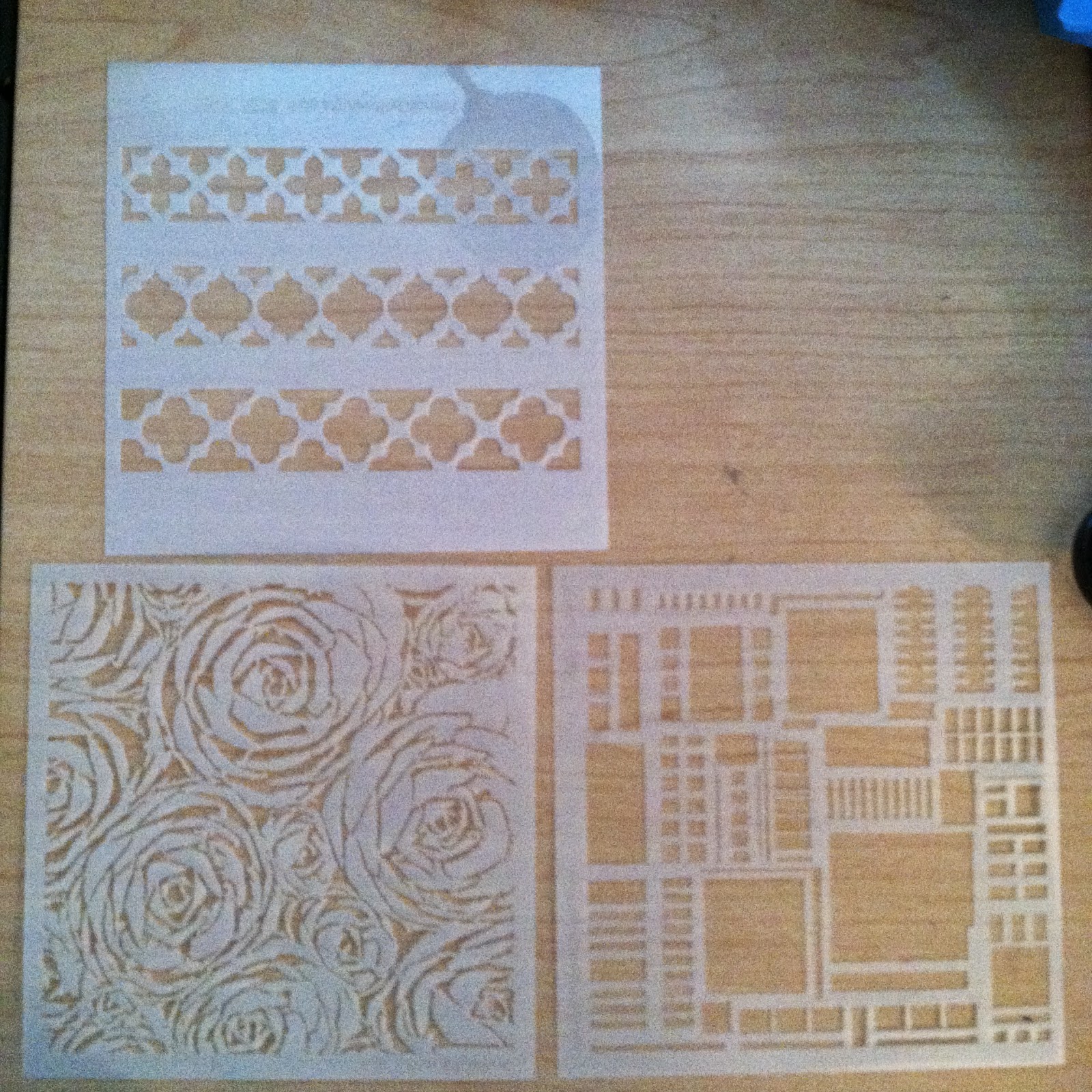
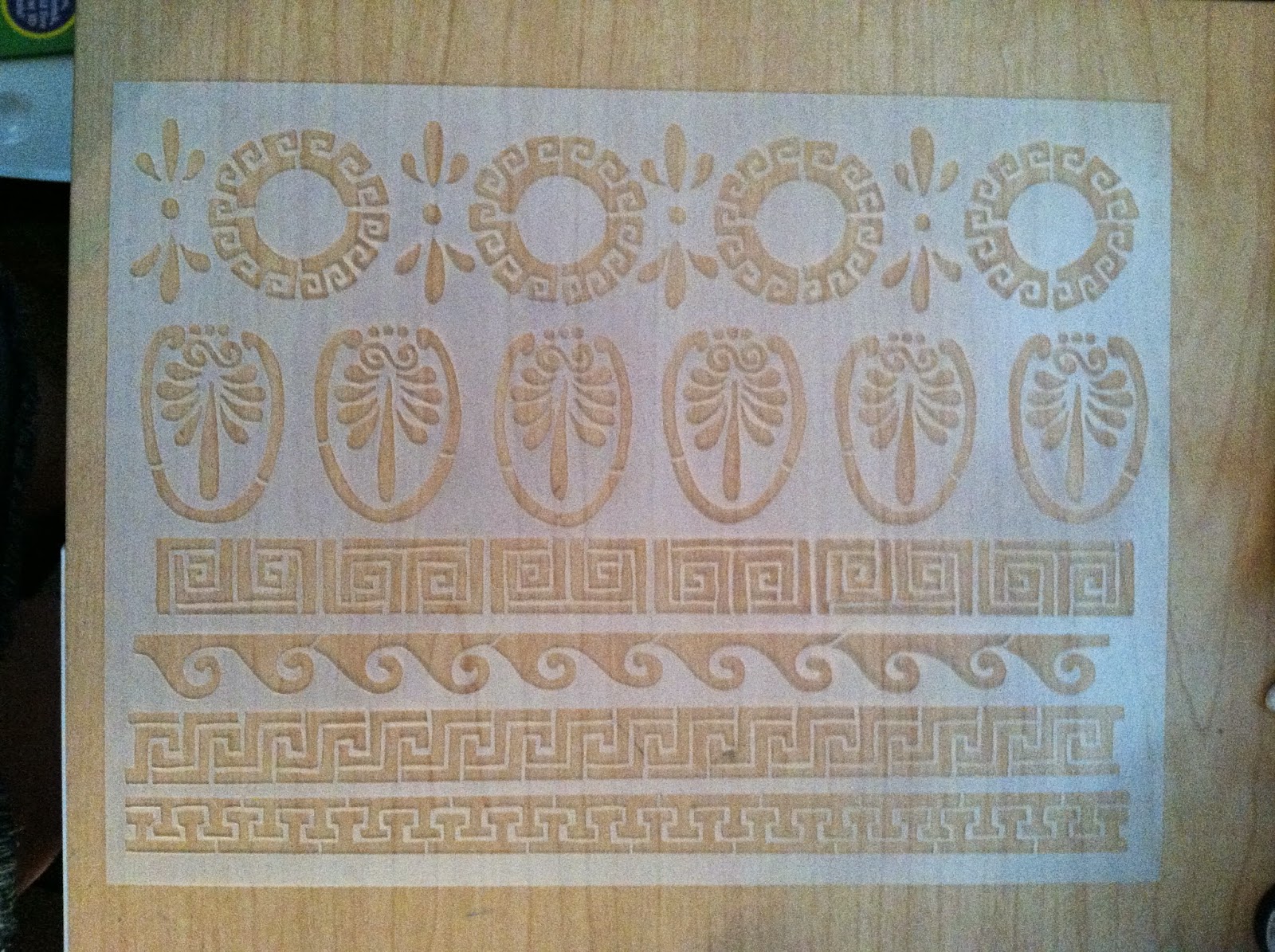
The stencils are from http://www.stencilgirlproducts.com/.  They have some great designs, I recently picked up some of the more versatile ones to use in my collages and other projects:


For the heart design I took some old stickers and cut out a heart, put the heart on the shirt then added the dye over it with the brush, to save dye.

Finally for the last and toughest design I cut two portions of film strip to a size that would just overlap my tape box, put down a layer of dye, then used the clear packing tape to fasten the strips down.  This is the only onesie I feel failed, but only because the images in the strip are too hard to make out.  According to the Lumi site film is one the the harder things to print from because it can vary so much, and not be thick enough to black out light where it needs to most.  I also found that the knit of the fabric made the image more obscured as well.  On a silk scarf or other item with a very fine weave it might have worked better.  Since Inkodye works on any natural fabric I may give silk a try in the future, as well as other fabrics too.


As you can see in the second shot the color comes up slowly once the prepped pieces are brought out into the sunlight since the dye in UV reactive.  So here's what the shirts looked like when I first set them out VS 20 minutes later when they were ready to wash.


The final washed versions were given to my friend Saturday at her baby shower.  Here's what they look like close up:


Look for another post soon, I have some art shots, travel reviews, and more on the way!

Love,
Lydia

Sunday, June 29, 2014

Chalkboard Paint & Lettering Tutorial

Hey folks,

I've been quite busy between work, life and a bunch of little things.  For now I've got my blog set up to match my Twitter and Etsy feel.  I've been writing down all the ideas I've had for posts and organizing them for future reference and I'm excited to see things come together as I work on some new projects and revamping things.

Here's the long promised chalkboard paint/paint lettering tutorial.  Plus at the end there's a review of a great Pinterest recipe!  Ready?  Here goes!

Chalkboard Paint & Hand Lettering Tutorial


So we started out with all the items in this picture:
-Elmer's chalkboard paint, (the small tub paints up to an 8sq ft section in one coat if I remember right.  This is the same tub I used mixed with a touch of white acrylic paint to make the chalkboard tray/announcement board for my wedding, so it lasts quite well.)
-a paper plate for use as a paint palette
-painters tape to help with edging
-scissors to trim down the printed page of letting you want to put on your piece
-a cup of water for rinsing your brush in between coats of paint so it won't get ruined, I recommend a plastic cup you don't mind having a bit of paint left on after you work, so that it becomes a dedicated painting/rinsing cup.
-a ruler in case you want to measure your object to know where you will place the lettering (I do a lot of eyeballing for placement, but only because I've had a lot of experience with making something like lettering look centered properly. I still use rulers plenty too!)
-a simple paintbrush that's larger for the chalkboard paint 1/2 inch-2 inch size as you prefer
-a good paintbrush that's smaller for the detailed lettering, size 2-6 in flat or round as you prefer
-any color of acrylic paint you would like to use for your lettering, I have two bottles shown in the picture, one is inexpensive craft paint and the other is a great textured paint by Golden.  I ended up using the Golden paint for my lettering.
-an object you want to paint, with a finish that will take the paint - something somewhat porous, not too slick that paint will slide or wipe off.  If the finish isn't properly absorbent you may need to buy a different kind of paint, surfaces like glass or metal would be a problem this way, additionally I don't recommend them for the lettering transfer technique because the graphite won't stick.
-and not shown, you will also probably want a piece of sandpaper or an emery board to finish the edges  of the paint next to where the tape was to smooth them perfectly.


Step 1.

Tape the sides of the board since you want to keep the chalkboard surface on just the one face of the object.  If you don't want to try to put the tape perfectly even along the sides leave just a bit sticking up.  You can see where I've done this, especially at the handle where the light shines through the tape a bit.  As you put on the tape try to rub it down onto the surface thoroughly to keep the paint from seeping under the tape as much as possible.  I tend to rub it enough to make it warm as a rule of thumb.  Some people refer to this as burnishing it to hold it down properly.  Be sure you know how long your painters tape is graded for.  If you leave it on past the amount of time it's graded for you will be much more likely to pull the paint off your finished work.  I usually get the 2 week tape for projects like this, though they make longer and shorter holding tape too.


Step 2.

Put some paint on your plate, use less than I did here....I wasted more than I meant to since I wasn't sure how much to use for the first coat.  You can always put more on the plate if you need to, but you really shouldn't try to put partially used paint back into the container if you have leftovers.  It will leave horrible clumpy bits and keep your paint from looking smooth as you apply it later.  Then use the big paintbrush to apply the paint.  This picture shows a very uneven coat and a half.  The chalkboard paint can be applied with a bit of a heavy hand, but of course will take longer to dry.  It's water based and easy to clean up.  I tried to go with the grain of the wood on the paddle, though in the cup divots I went in circles, and those areas didn't take paint as easily and I ended up doing a total of 4 coats of chalkboard paint, applying two the first day I worked and another two a different day.
 You can see the difference here after two coats!  Much nicer already.


Step 3.

Between coats you can begin prepping the lettering for transfer.  First make sure you know the size you'll need to print the lettering at.  Then select a good typeface, figure out what size and style font you want (bold, italics, etc), and then print it off in solid black ink.  Hold it up to your object and make sure it's the right size.  If so you're ready to apply some graphite to the back of your printed letters.  If you have it available use a nice soft pencil, I chose a 6B, but most regular pencils will do.  The harder the type of lead the lighter the grey color will be for you to paint over/within the lines of.  Use the side of the pencil only, no point, and give a good coating as I was working on in the picture.  Then set it aside for later.


Step 4.

After you're done painting and the paint has had a full day to dry you can gently pull the tape off.  You'll probably notice some bits of paint that dried sticking up because they attached to the tape or areas that the paint seeped down under the tape.  By the time you take the tape off you'll probably feel like it ended up being a messier job that you thought, but this is where the sandpaper of emery board comes in.  Sand the surface just enough to take off the excess paint.  If you want a antiqued look you can continue and it will soften the edges, which might be perfect for a shabby chic style piece.  Here's a bit of my messiness:


Step 5.

Next trim your lettering as close to the edge of the word or phrase as you can.  Measure its height and width if you want to line it up perfectly on your object.  Then measure your object and add any measurement lines you might need to keep the lettering straight on your object. Use a soft pencil along with the ruler and a the measurements to guide you.  Don't press down much with the pencil or you won't be able to erase it later, and may leave imprints in a wood surface.   Then use at least 2 pieces of painters tape to tape your letters in place.  If there's lettering underneath the tape be sure to trace the edges on top of the tape before starting the next step.


Step 6.

Go over all the printed parts with a pencil or wood/plastic stylus to rub the graphite from the back of the paper onto the surface of your object.  Be firm, but remember if you go too crazy you might leave indentations.  This picture shows part of the G and R.  I only traced the edges of the parts under the tape.  You'll have to be very careful with that part and may want to go over the line a couple of times to make it look straighter.  You can also see the measuring line I used to help line things up correctly.

Step 7.

When you've gone over all the lettering (Or any design you choose, this isn't limited to lettering if you want to get creative.) carefully peel up the tape at one end of the transfer and check to see how well it copied.  If you're happy with it take off the entire transfer paper and go ahead and paint over your graphite design.  If you feel unsure of how to do this correctly, do a small test design beforehand.

Step 8.

When painting your design using at least two coats is recommended.  You can see the difference here between what one and two coats looks like.  I did 2 coats plus a bit of touch up at the edges on my lettering.  Please note if you are using a light color your first layer will probably pick up a bit of the graphite.  If so don't worry too much, you may need to do an extra coat of paint to get good coverage, but the subsequent coats will not pick up the graphite because they will be trapped within the first layer.  Acrylic paints are water based, but use plastic as a component.  So when they are fully dried you shouldn't be able to dissolve coats of paint you applied earlier or any graphite that may be stuck in them.  If you do encounter this I suggest switching brands to see if it helps.

The Finished Project - Beer Tasting Paddle

Once your lettering or design dries overnight you should be ready to go!  The resulting surface will not be dishwasher safe, you'll want to carefully hand wash it or use a damp cloth to wipe it down as needed.  Here's my finished paddle, the chalk lettering is a bit harder to make out because I could only find a big hunk of sidewalk chalk.  Classroom chalk is much more legible, so I recommend that if possible, I just used what I could find easily around the house.

If you test this tutorial out please feel free to share your results in the comments!  I'm happy to help with any questions you might have too.

I think this would be a great way to customize bridal party presents, a special birthday surprise, or a family plaque, plus a host of other types of items.


So the Pinterest recipe I tried this time around is one for Hawaiian style BBQ chicken.  You can find instructions for it here.  I followed the instructions, substituting Sweet Baby Ray's Hawaiian BBQ sauce for the Archer Farms one and using 5 chicken breasts.  I also accidentally poured in a bit of pineapple juice when I almost forgot to drain the can, maybe a couple tablespoons worth.  I felt that my crock pot wasn't cooking quite as fast as hoped for after two hours on low because the chicken towards the top was still mostly frozen.  I then put it on high and 3 hours later (5 hours total cooking) it was done.  I served this to my husband and two of his brothers when they came for dinner earlier this week and it was a unanimous hit!  We served the chicken shredded like pulled pork on Hawaiian style buns with sides of corn and Caesar salad, and it was fantastic!  I think next time I might try adding a couple more chicken breasts and cooking longer, so I'll have leftovers.  There seemed to be enough sauce for 6-8 pieces of chicken, and plenty of pineapple, I think we still had 2/3 left afterwards, though most of us liked it with less pineapple overall.  With a little extra sauce I think this could work for 9-12 pieces of chicken, or more depending on your crock pot size, our model is a 5 quart one.  Here's a shot of the finished product, (one of the guys decided to add lettuce to his):


Hope you all are having a great weekend, and I'll see you again soon!

Love, Lydia