Love, Lydia - Notes from a geeky, plus sized artist.: 2014

Tuesday, December 23, 2014

Christmas Eve Eve!

Merry Christmas everyone!

It's Christmas Eve Eve here in Raleigh and I've got lots on my plate as I finish getting ready for Christmas.  I thought I'd share a bit with you all about my life lately as I prep things.

Bryan and I have one stubborn gift left to get (for that one person on our list who's ever so hard to shop for of course!), and over half of our gifts left to wrap still.  However, we went to Richmond for a Thanksmas weekend with my family over December 12-14.  A lovely ham dinner, plus our gift exchange, and lots of time to just relax with family.  My dad and I got to catch up while doing some shopping and taking the dog out for a walk.  I tried to help my mom with the cooking, but she had picked some really easy dishes and barely needed me!  My parents are working on moving to Richmond in the near future and there were boxes stacked in my uncle's living room from it, but they disguised them as presents.  I have to say it made things very festive!


Other than that I've been busy with several commission pieces two watercolors, and four collages plus trying to fit in bits of other new work as I get the ideas.  I've been decorating here at my own home, and doing domestic things.  Here are a couple shots of my own tree:


I decided to go with a more rustic theme this year, last year I did all cool colors with more modern ornaments.  I shopped for a bunch of this year's ornaments while I was visiting with my parents some in November to help a bit with prepping their house for moving.  My mom and I took a trip to Ikea, and also found some of the ornaments at Kmart (the deer and white frosty bulb ornaments), and Cracker Barrel (the burlap banner with the Cardinal design and the heart ornaments).  Plus Bryan and I have been collecting ornaments on some of our little vacations, so we have things from St. Augustine, Florida, Epcot Center, The Smithsonian Museum, and I'm sure others I can't think of too!  And I made the bow for the tree myself.

Bryan and I have kept busy socially, between going to Raleigh's First Friday Art Walk (where I had a couple of pieces in a show this month!), checking out the Boylan Heights Art Walk (an amazing annual juried show that hosts artists on porches and yards in the downtown neighborhood of the same name), exploring Durham (we'll be moving there this coming spring to be closer to Bryan's new job), and going to the Pittsboro Christmas parade with family.  We've been spending most of our free time with family honestly, whether we're playing games, going to the movies, or just hanging out.  But I've ramped things up with work between the commissions and becoming more involved with the arts community on Tsu (Seriously, it's worth checking out!  There are loads of great artists, crafters, and photographers there, and you earn rewards for simply posting the content you make.  Join using my link here if you'd like.), so I haven't had a ton of free time beyond all that which hasn't been sucked up by things I've already mentioned.  Including spending time with out new little family member Scarlet, a Mini Rex rabbit.  Here's a little photo collage summing up all these things.


So, now I've got to run, groceries to get, presents to wrap, paperwork to finish, cleaning to do, gifts to finish making, and then a break from blogging for the rest of this week as I celebrate Christmas with family.  I can't wait for dinner and the Christmas Eve service with Bryan's family tomorrow night, and then be enjoying each others company for the next few days.  I hope you all will be having a very merry Christmas with your families too.  And look forward to seeing you again soon!

With love this holiday season,
Lydia

Sunday, December 21, 2014

My Mom's Chili Recipe

Hey folks,

So this weekend I made chili for Bryan and I, and I wanted to share the recipe with you all.  It's ridiculously easy to make and always a crowd pleaser.  I got the recipe from my mom, and then changed it a bit to suit our tastes.


Here's what you'll need:

1 can Pinto Beans
1 can Dark Red Kidney Beans
1 can Light Red Kidney Beans
1 can Petite Diced (Peeled optional) Tomatoes
1 can Corn (We like Sweet White, but it's harder to find)
1 packet of your chosen chili seasoning (We use Kroger's mild variety)
a 1lb package of Regular/Mild Breakfast Sausage (Jimmy Dean, or whatever brand you like)
1 1/2 cups water

Optional ingredients/condiments
1/8 cup sugar
1 diced onion
1 box Ritz Crackers
8 oz Sour Cream
2-4 cups Shredded Cheese (We usually get a Mexican style blend, but Colby Jack would do well too.)

You can make your chili spicier by using hot seasoning and sausage, or add the sugar to make a more savory chili.

Don't drain the beans, corn, or tomatoes, their juices are part of the chili too.  The skin on the dark red kidney beans tends to be thicker than Bryan likes, so we often put them in a chopper long enough to break the skin and split most of the beans, allowing the beans to soften as they cook.  But this is not necessary.

We don't care for onion, but my mom originally put it in her chili if I remember correctly.  So for those who like onion it's great.  My own addition to this chili is corn, which adds just a bit of flavor on the savory side.

Brown the meat (drain off fat if needed), then put all the ingredients in a crock pot set to high for at least 5 hours stirring occasionally.  By that time it should thicken up nicely, and once it's thickened it's ready to serve.  You can let everyone eating add crackers, sour cream and shredded cheese as they see fit.

The recipe serves 4-5 people, and is quite hearty.  However, you may find folks go back for seconds, if so you can double the recipe.  Though it won't fit in a standard crock pot if you do, to get around this I usually set a bit of each ingredient aside in a bowl.

Feel free to add more ingredients to make this recipe your own!

Love,
Lydia

Friday, December 19, 2014

National Park Adventures Part 3

Hey folks,

So here's the second installment about the trip Bryan and I took down the Blue Ridge Parkway in September.  The weather was much more cooperative this day, so I managed to get better shots of the stretch between the Museum of NC minerals and Asheville.

For starters we made a stop at the museum, which sounded pretty great, but turned out rather disappointing because the museum was a bit rundown.  It looked like it had been updated about 10 years ago, but had bits that were broken or badly maintained and some outdated science thrown in for good measure.  Though Bryan was the one who spotted that bit, not me.  Bryan and I were both feeling under the weather, having caught a nice cold.  We decided we'd start on the parkway and see how we felt, which like the weather got a bit better.  Neither of us had the energy for the planned stop at Mt Mitchell, however, which was a bit of a letdown after how much I'd read about the unique environment there.

Mt Mitchell is the highest point east of the Mississippi River at 6,684 ft high.  Because of the elevation there the climate is more like Canada than North Carolina.  If you visit there are many dead tree skeletons, Fraser Firs, which have been killed by a combination of acid rain, air pollution, and possibly invasive insects as well.  We stopped often to catch views of Mt Mitchell as we climbed our way up to Craggy Gardens, our next stop.


All these shots are from various overlooks along the way, with my husband, Bryan in the one on the bottom there.  The views at each stop were spectacular.  The beetle is from one of the stops just as we were getting into Craggy Gardens; there were picnic tables nearby and he was happily taking in a bit of sun.  I believe it's an Oil Beetle - Meloe Impressus, probably a male because he has a kink in his antennae. Here's a closer cropped version -


As we approached Craggy Gardens I knew there would be a lot more rhododendron bushes present, but I really didn't realize there were incredible open meadows and very little tree cover.  The name for these open areas are balds.  They are generally believed to occur naturally, though some experts theorize they were created by Native Americans as areas to aid hunting practices.  Most balds present in the Blue Ridge Mountains have been vanishing over the last century, taken over by woodlands again.  In any case, Craggy Gardens still hosts many impressive balds, which took my breath away.  In some ways they reminded me of the Irish countryside, especially that of the Burren and Connemara where there is also little tree cover and the rocks jut up from the sides of the low mountainsides.  Additionally, the elevation was still quite high at Craggy Gardens, and there were Juncos present singing and flitting between the rhododendron bushes.  It was a happy little surprise for Bryan and I since they're one of his favorite birds, which is only present in Raleigh during the winter.  Below are a couple views of Craggy Gardens plus the sunset along I-40 on the way home.


After Craggy Gardens we descended in elevation growing closer to Asheville.  Our next stop was the Folk Art Center at milepost 382.  I was blown away by it, as it's really more of a museum in some ways with a huge craft store alongside.  Most of the work was truly art, made in both the traditional styles of the mountain culture and in more modern forms as well.  They boast 3 galleries over 2 stories, with beautiful architecture throughout.  The artists in these galleries are members of the Southern Highlands Craft Guild, and some of the same artist's work was available at Moses H. Cone.  The mushrooms pictured below were on the lawn outside the building.  We completed out trip with a visit to the headquarters of the Blue Ridge Parkway at milepost 384, it was no standout, but had a couple of fun activities and displays for kids.  Then we head back east to Raleigh, having seen the first few fall leaves of the year, and carrying a bit of art back home with us.


I've been quite busy with commissions, new art pieces, and preparing for the holidays this past month and regret that I didn't finish this post sooner.  However, I've got more posts on the way, and I'm looking forward to a new project for the new year.  I plan to be exploring a Pinterest pin every day of the next year and blogging about my experiences.  I'll be covering all kinds of pins from food, art techniques, cleaning tips, beauty tutorials, and more.  I promise there'll be something for everyone, and I'll be taking you readers along with me each step of the way!  It's going to be a big year!

Til next time - Love,
Lydia

Sunday, November 16, 2014

70 No Knit/Crochet Yarn Projects

Hey folks,
So, a little while back one of the gals I follow on Tsu (which everyone should check out, it's the next Twitter/Facebook, but better) was looking for ideas on what to do with some boucle yarn.  It's tough to work with since it shows less stitch definition in knitting and crochet and it's kind of lumpy, but can be really beautiful.  Anyway, it got me thinking about how many great ideas there are out there for ways to use yarn that don't involve crochet or knitting.  I thought I'd put together a collection of them here.


1. Modern Dreamcatchers - Mollymoo Crafts

2. 3. 4. Lampshades, Lanterns, and Globes - MADE Everyday (video)

5. Fiber Art Wall Hanging - Official Etsy Blog

6. Text Based Wall Art - Debbie Smyth

7. Garlands (could use lace instead of the crochet bit shown and could try tassels instead of pom poms) - Uppercase Magazine

8. Yarn Wound Blocks for Stamps - Print & Pattern

9. Yarn Scrap Wall Art - Easy Makes Me Happy (you could use a photo

10. Mini Globes for Sting Lights - EHow

11. Woven Friendship Bracelets - Unicorn Hat Party (I made these all the time with campers when I worked at a summer camp in Maine!)

12. 13. Yarn Bowls and Huge Lanterns - Top Inspired

14. Yarn Chandelier Version One - Ruffled

15. Yarn Chandelier Version Two - Wedding Chicks

16. Superhero Coasters - Kandy Kreations

17. Cross Stitch on Pegboard - Dudua

18. Or Embriodery on Pegboard - Hand Made Romance/Evie Barrow

19. Yarn Covered Pipe Cleaner Lettering - Bloesem Kids

20. Old Fashioned Yarn Dolls (could be used as holiday ornaments too) - Spud & Chloe

21. Yarn Octopus (another possible ornament idea) - Craft Stylish

22. Felted Balls for Beaded Necklaces or other crafts - Instructables

23. Easy Greeting Cards (use any silhouette image and you could even make them larger to frame as wall art - Katie's Crocheted Goodies

24. Pixie Tutu - Bugaboo, Mini, Pip, Mr & Me

25. Circular Weaving - Beesybee Fiber and a follow up post here too.

26. A Felt Leaf and Yarn Garland - A Beautiful Mess

27. Pom Pom Scarf/Garland - Bubbly Nature Creations

28. Woven Rug/Anything Square or Rectangular - Fab Art DIY

29. Cardboard & Yarn Ornaments - Snap!

30. Yarn Ornaments You Can Make Any Shape - Decora Recicla Imagina (photos instruct well enough that you probably don't even need to translate the page!)

31. Mini Wreath Ornaments Using Shower Curtain Rings - Smile Like You Mean It (imagine all the fun little things you could decorate these with, from floral bits to miniature objects)

32. Yarn Filled Ornaments - Dollar Store Crafts or the Fantastic Pokemon Themed Version - Jabberwonky

33. Yarn Wrapped Presents - Strawberry Chic

34. Yarn Surprise Ball - Lisa Vollrath

35. Wrapped Star Ornaments - Frugal Fun 4 Boys

36. Yarn Wrapped Pine Cones - Family Chic

37. Yarn Wrapped Paint Rollers - Home Dzine

38. Costume Wolf Tail - iSave A to Z

And last but not least:

32 More Projects (no duplicates from the above!) - Buzzfeed

Hope you like them!  I'm going to start numbers 26 and 24 soon myself.  I've got way too much yarn in my stash and need to get to work using it up.  If anyone has more ideas (especially from your own blogs) I'll gather them up and make a second post with more.

Til next time.

Love,
Lydia

Wednesday, November 12, 2014

National Park Adventures Part 2

Hey everyone,

So as a bit of introduction I thought I'd share a bit about why I'm writing about National Parks.  I've always loved National Parks and Historic Sites; as a kid my mom dragged my brother and I out to all the ones she could since we were homeschooled.  And I'm pretty sure I loved every minute of it then as much as I would now.  I'm going to be creating a page on here with a list of all the ones I've been to because I have a goal to visit them all one day.  This is more ambitious a goal than some of you may realize because there are over 300 of these treasures in the US and its territories.  So I think I'd settle for all in the states if I had to, though I'd love to get to the more exotic parks as well.  I'm even geeky enough to have a National Parks Passport to record it all since they have rubber stamps to ad cancellations at each park, sometimes more than one stamp for larger parks!


Anyway, Bryan and I took a trip up into North Carolina's mountains back in September for a family weekend.  On the way there we took the Blue Ridge Parkway from about milepost 277 at Deep Gap to 316 at Linville Falls, and on the way back from our weekend we went from around milepost 332 at the Museum of NC Minerals down to 383 and the Blue Ridge Parkways Headquarters in Asheville.  The two stretches were very different thanks to the weather.  Here are some of the highlights.


On Friday's leg of the trip we were able to see Moses H. Cone Memorial Park.  It's a mansion that used to be owned by Mr. Cone, which was willed to the park service with the condition that the land be preserved and open to the public.  Housed inside the building is the Blue Ridge Parkway's craft center.  Bryan and I bought a lovely pair of prints by artist Debbie Littledeer and really enjoyed all the work from the members of the Southern Highland Craft Guild. When we'd left Raleigh it was bright and sunny, but as you can see in the pictures above the weather was changing as we traveled.  In fact I don't even have pictures from our second stop at Linn Cove Viaduct.  The mountaintops were covered in clouds and visibility was low.  We sadly missed out on the iconic view of the engineering marvel that is the Viaduct area.  Here's what it looks like in good weather:

Image from DigitalHeritage.org blog

I'm originally from Roanoke, Virginia, so I grew up with the parkway being a fixture in our Sunday drives and family picnics.  However, what struck me most on this weekend trip was how different the North Carolina sections of the parkway are from the portions I'm familiar with.  For starters all of the 16 tunnels on the parkway are in the NC section.  Additionally the NC section is much higher in elevation overall.  Here's a chart that compares using the height of the viaduct as the example -

Image from BlueRidgeParkwayDaily.com

Over the weekend we spent time with family celebrating birthdays and anniversaries at the Nu Wray Inn in Burnsville.  It's a fantastic little town that's close to Mt Mitchell, the highest point in the US east of the Mississippi River.  We walked the downtown area shopping, visited the Saturday morning farmer's market, and enjoyed to garden and front porch at the inn.  The weather was just starting to feel like fall, which made it lovely for hiking and being outdoors.  Some of us decided to go the underground route however, and visited Linville Caverns as well.


On the trip Monday we started with the Museum of NC Minerals and went south from there.  However, this entry is getting a bit long, so I'll write more about the second part of the trip very soon!  Take care and I'll be back soon with a post about various ways to make crafts and DIY projects with yarn that don't involve any knitting or crochet!

Love,
Lydia

Saturday, November 1, 2014

Painting Time

Hey everyone,

So the commission I had earlier this month is all done.  I'm happy to share it with you all now.  It all started when I got a message from a man on Etsy, asking if I could paint a Celtic knotwork design on his Irish Bodhran drum.  I've never worked on a project like this before, but was excited by the prospect.  I did some quick research and found I would easily be able to do it, using high quality acrylic paints.  (If it was to be used regularly I'd also need to varnish it with a protective coating, but this drum was for display.)  So, I showed him some possible designs, he chose one, and then sent me his 18 inch, goat skin head, Bodhran drum.  Here's a few shots showing how the piece came together.  The sketchbook is the Fabriano EcoQua one that I got in September's Pigment + Palette box.  I've found I really like working with the dotted paper and that it holds up surprisingly well to acrylics when I tested them in the book to prepare for this painting.

Next on my plate was testing out some items from the October Pigment + Palette box.  I've tried Aquabord before (a hard panel perfect for watercolors that can be framed without glass), and enjoy working with it, but the other products are new to me.  Today I focused on the Qor watercolor samples.  The Qor line is made by Golden, whose fluid acrylics I have come to love as I worked with them more (and bought a few more bottles of) while working on the drum.  I was a little unsure of the Qor line at first, but here's a quick rundown of the colors I was able to test.
The colors are as follows, on the left the Qor line and on the right the most comparable color I had on hand.  Overall I think the Qor colors performed well and from what I can tell the quality is somewhere close to that of Winsor & Newton, but not quite M. Graham or Daniel Smith.

Qor Cobalt Teal VS Winsor & Newton Cobalt Turquoise Light.  These colors are virtually the same and come from the same single pigment PG50.  The both have about the same amount of pigment in the paint as far as I can tell.  In this case just buy whichever is on the best sale.  They're both quite lightfast, though according to Qor's website most of their line doesn't seem to have been tested yet.  Winner: Tie

Qor Dioxazine Purple VS Grumbacher Violet (Thalo Purple).  Dioxazine Purple is known to use a somewhat lightfast pigment PG23, but it isn't perfect.  Personally I wouldn't buy this pigment though it's lovely looking.  The Grumbacher Violet is slightly more lightfast, but only by a little bit using PV19 & PB15, though it can get a similar look when the ratio of paint to water is increased.  In terms of pigment for your dollar Qor is better, but Grumbacher wins for lightfastness despite being a more watered down student quality paint.  Winner: Grumbacher

Qor Quinicridone Magenta VS Grumbacher Carmine Hue.  Quinicridone (PR122) will be joining my palette soon because it reminds me a lot of the Cotman Mauve I used to love, but sadly found out was less lightfast than my standards would allow.  The Magenta is a solid shade that's slightly more cool in tone than the Carmine hue (PV19 & PV19, unsure why it's listed this way on the tube, different sources perhaps?) I compared it to.  The Magenta is also slightly more lightfast, so if mixed with Cotman's Raw Sienna it will likely be used in the future as my go-to combination for lighter skintones. Winner: Qor

Qor Transparent Pyrrole Orange VS Grumbacher Alizarin Orange.  In looks the Pyrrole is stunning, the color pops off the page, and while the Alizarin (PY65, PY150 & PR209) comes close it's not quite as intense.  Both are less lightfast colors, the Qor (PO71) slightly more so, which means I probably won't use either one often if I can help it.  However, for a project that will be used from photographs or a short term use the Pyrrole would be a great choice.  Winner: Tie

Qor Quinacridone Gold VS Cotman Raw Sienna.  Both of these colors are fantastic to work with, really it comes down to which effect you prefer from what I can tell.  Qor seems to be less lightfast (PO48 & PY150, this in the only color that's been tested so far of those I sampled), but when I checked the pigment information it seemed a very stable color.  Raw Sienna (PR101 & PY42) would give the same overall color, but with stronger effects at the edges and paler center sections in each stroke.  Winner: Tie

Qor Green Gold VS Grumbacher Thalo Yellow Green.  These colors are visually the most different pairing I had during my tests, so apologies there.  I found the Green Gold a great new choice, with few easily available colors locally that could compare.  It's lightfast using PY129 whereas the Thalo shade is slightly less lightfast using PG36 & PY3.  The Green Gold is a rich shade, but the Thalo is much more neon, which would be suitable for some temporary projects.  Winner: Qor

Please note I tried not to go too far into the details of how lightfastness is rated because many brands use different scales.  I prefer not to confuse anyone, so I have simply used comparatives to illustrate my meaning in this article.  I find lightfastness to be of considerable importance when selecting materials to work with, and at this point try to stick to only the highest rated colors if at all possible.  A couple of years ago I bought the book "The Artist's Guide to Selecting Colors" by Michael Wilcox, which is how I began to change my colors, and more recently this fantastic website as well.  The website has some more recent additions, though I occasionally come across colors that neither has a record of, in which case I check the manufacturer's site, Google search, or avoid using the color if I can't find out the rating.  It sounds strict and occasionally I do wish there were more shades of purple to use, but I know it will pay off years down the road when my grandchildren are able to see my art with colors as intense as they were when I painted each piece.

Thanks for reading, next time I'll be writing more about some of my travel adventures.

Love,
Lydia

Tuesday, October 28, 2014

Inkodyed Onesies

Hey friends!

So, over the last week I finally got to use the Inkodye that I received in my September Pigment + Palette box.  I'd been itching to use it from the start, but having trouble coming up with ideas for the magenta dye.  Then one of my best friends told me she was having a little girl, so I had the perfect excuse to use the dye!  I got some 100% cotton onesies, just the basic kind, nothing fancy.  And here's how I made the designs.

First off I looked at the instructions and ideas at http://lumi.co/guides/shadow knowing I'd want to try making shadow prints.  Inkodye works a lot like photographic emulsion, so I instinctively knew how I wanted to use the dye, but wanted to get it right the first time since the onesies were a gift.  Out of the 4 I made I think 3 were very successful and the 4th just so-so.  Tell me what you think:


So to make things like these I used some really simply methods and supplies other than the dye and Inkowash (a rinse that essentially removes the active agent in the dye making it light safe).  Things I used:
Painters tape (yep the kind for painting walls, one inch width)
Packing tape
Stencils
A round foam brush
A mini ironing board (any board or easy to move flat surface to lay items on while prepping and setting in the sun)
Some cardboard scraps (put inside the onesies to give a flat surface & prevent dye bleed through)
Scissors
Some old stickers I had
The onesies
A washing machine (hand washing would work too)

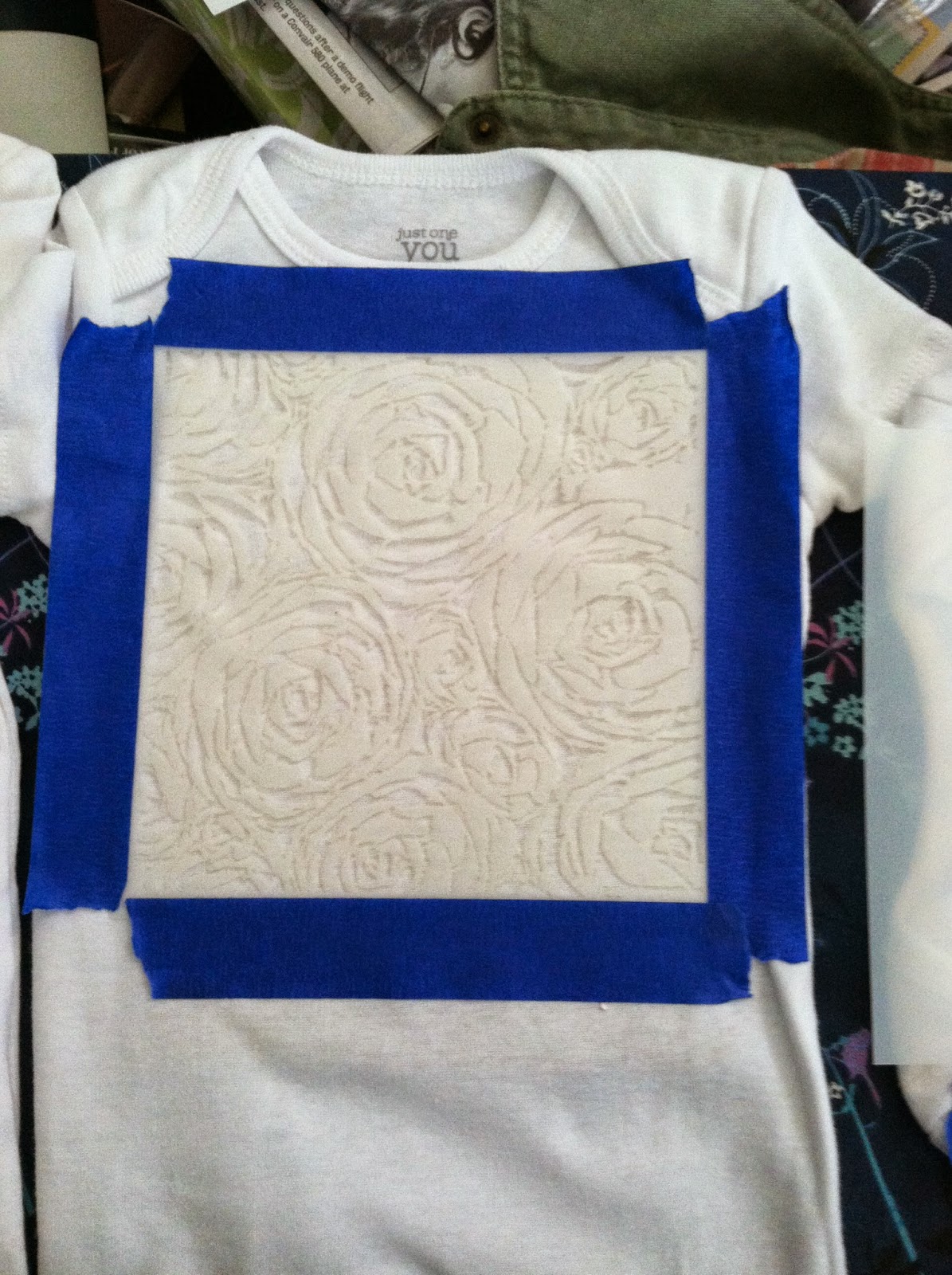
The instructions for shadow printing are basically this, put ink on the part of the shirt you want color, the block off the inked section with items that will become your design, or use something like a stencil to guide ink into just the areas you want it.  To facilitate this I used painters tape to tape down the stencils and used the round brush to put on the dye.  Here's a shot before the dye:


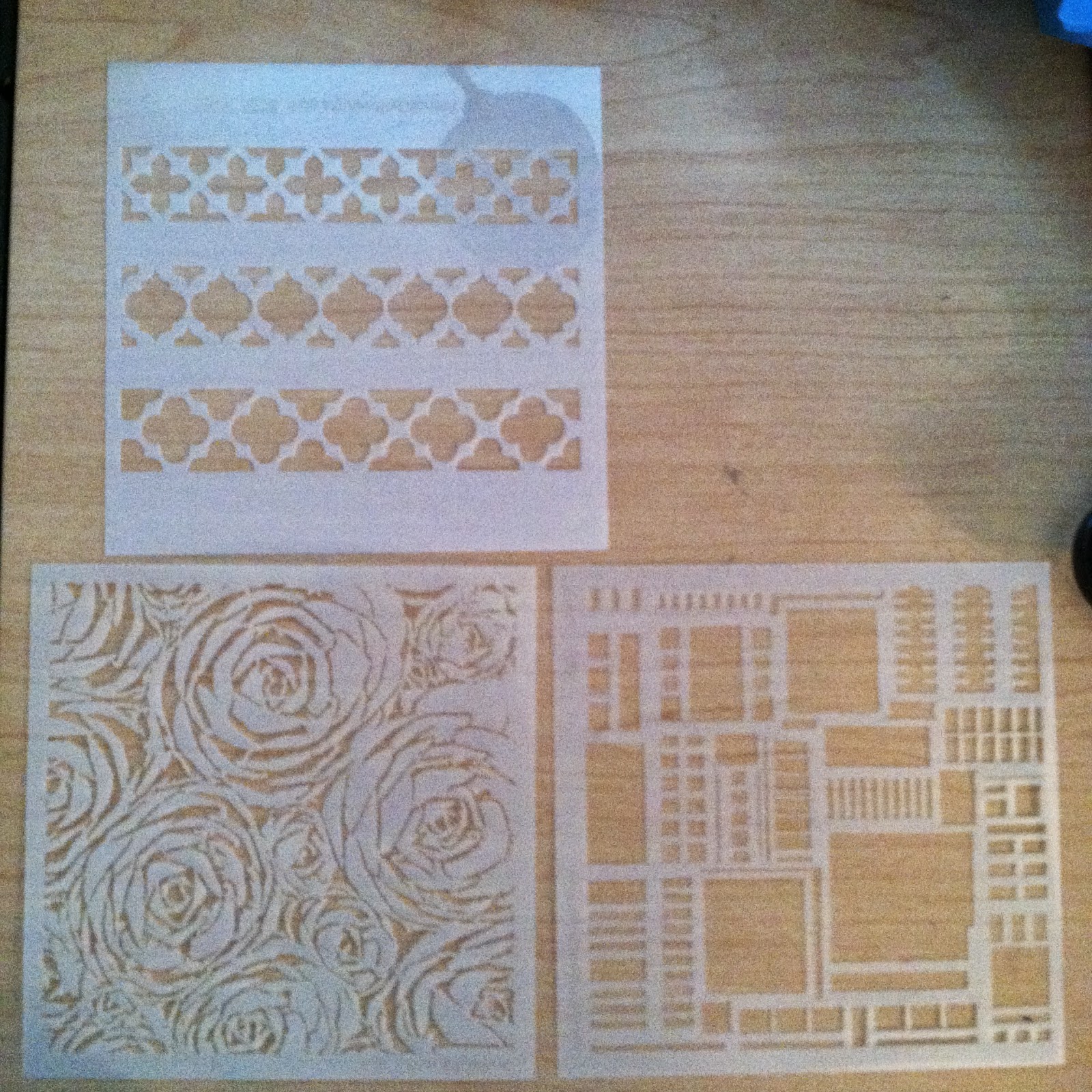
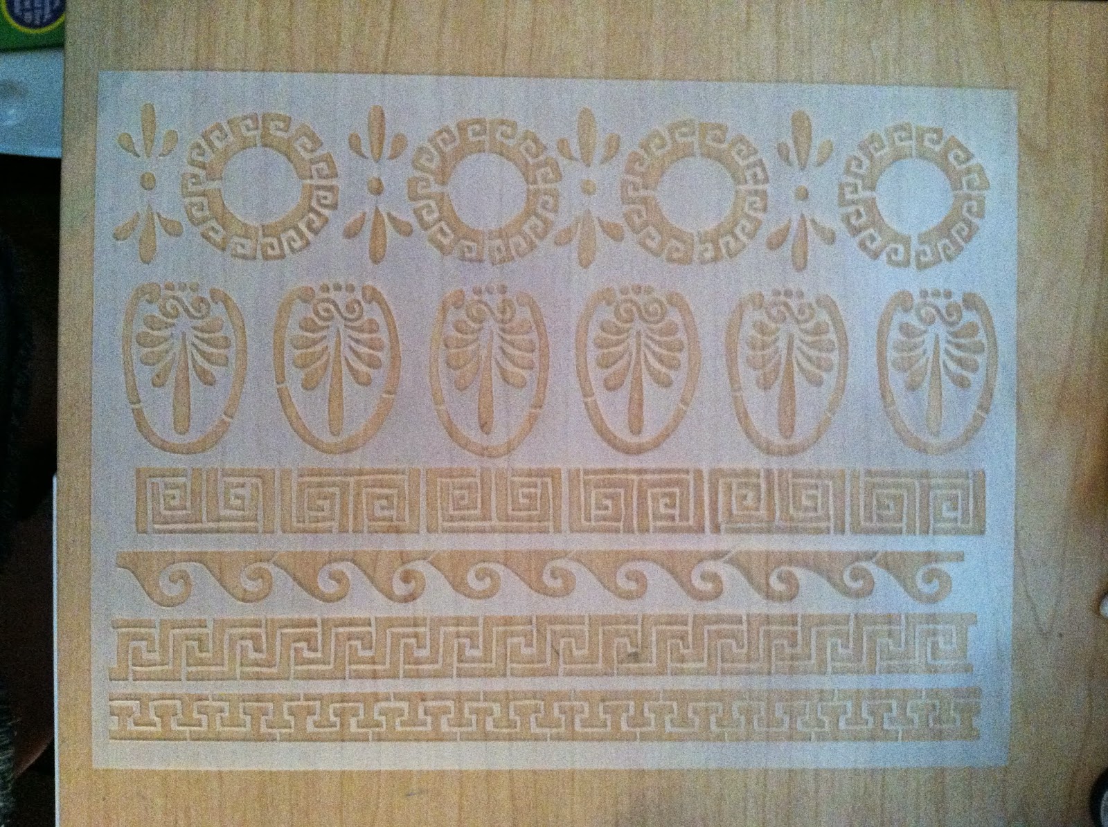
The stencils are from http://www.stencilgirlproducts.com/.  They have some great designs, I recently picked up some of the more versatile ones to use in my collages and other projects:


For the heart design I took some old stickers and cut out a heart, put the heart on the shirt then added the dye over it with the brush, to save dye.

Finally for the last and toughest design I cut two portions of film strip to a size that would just overlap my tape box, put down a layer of dye, then used the clear packing tape to fasten the strips down.  This is the only onesie I feel failed, but only because the images in the strip are too hard to make out.  According to the Lumi site film is one the the harder things to print from because it can vary so much, and not be thick enough to black out light where it needs to most.  I also found that the knit of the fabric made the image more obscured as well.  On a silk scarf or other item with a very fine weave it might have worked better.  Since Inkodye works on any natural fabric I may give silk a try in the future, as well as other fabrics too.


As you can see in the second shot the color comes up slowly once the prepped pieces are brought out into the sunlight since the dye in UV reactive.  So here's what the shirts looked like when I first set them out VS 20 minutes later when they were ready to wash.


The final washed versions were given to my friend Saturday at her baby shower.  Here's what they look like close up:


Look for another post soon, I have some art shots, travel reviews, and more on the way!

Love,
Lydia

Thursday, October 23, 2014

National Park Adventure Part 1

Over the past couple months I've managed to have two great encounters with park locations.  Here's a quick write up of the first adventure!

So back on Labor day weekend I was itching to do something as my husband and I visited my family in Richmond, Virginia.  No one was feeling like going too far, so I took Bryan and my dad out to the Maggie L. Walker historic site for a tour.  My mom and I had visited a couple years ago and were highly impressed.  My husband and dad agreed with this opinion once they saw the importance this site has.

Maggie L. Walker was the first female, African American bank founder, and the bank was the longest continuously running African American operated bank in the US, 1903-2009.  Plus she did amazing things in her community through the Order of St. Luke and her connections with other prominent individuals during her lifetime.  The site includes her home as well as several nearby buildings, and her house is a gem among them.  She presented a completely modern, elegant face to the world through her home, which had electricity, indoor plumbing, and eventually an elevator, all before 1930!  It's heartbreaking that Walker isn't better known to the world considering this is just the tip of the iceberg when it comes to all she did during her lifetime.

This picture is from the NPS site

There's a fantastic virtual tour you can see here at the NPS website, but I recommend a visit in person if you're able!

Next up, I cover some some stretches of the Blue Ridge Parkway I've never visited here in North Carolina.  Plus a blog about some interests that lie closer to home, and updates on art.  Til next time!

Love,
Lydia

Tuesday, September 30, 2014

September Gold and Grey

September has been a gold and grey kind of month.  Lots of lovely memories and good times with family, but stormy and rough around the edges.  For most of the month it still felt like summer here in Raleigh, with hot weather and the trademark humidity that goes with it.  Slowly over the last week rainy weather has given way to slightly cooler temperatures and the leaves are starting to show their first hints of gold and blush red.  A few nights ago I even had to break out the comforter, though I'm not needing it every night yet.

Meanwhile I've got so much from summer that I've been meaning to write about...and depression has been encroaching heavily.  Some may have been caused by an imbalance in some of my medications, but a good chunk has been from financial, other health, and job related stresses too.  I've been looking for a job off and on since January, with very mixed results.  I can't even comment on all of it yet, but prayers and such are always welcome since despite the normalcy most of us show the world, there's some turbulence hiding below the surface.  Though over the past few weeks I've had a very interesting painting commission fall into my lap, so I'm happy to be tackling that and sharing photos as I complete it.  One of my birthday gifts is also rather exciting....I've got a subscription to Pigment + Palette, a monthly art supply box which gets delivered to me the first week of each month and contains fantastic products from a wide variety of media.  Here's a shot of September's box contents:

A set of Bruynzeel-Sakura pencils in 2H, HB, 2B, and 7B
Lumi Inkodye in Magenta (plus a month of free dye technique classes online)
A trusty Excel #1 light duty knife (oh, the memories of using these from CCAD!)
A lovely red Fabriano EcoQua journal with dotted (almost like graph paper) that's great for sketches on the go
Plus an artist postcard from the featured artist of the month

The dye is what has me most excited, it's sunlight activated and can be used on cloth or paper.  So I could use a photographic transparency to print with or use with objects or cut paper designs similar to making a Photogram.  The options are open enough that I'm having trouble deciding.  And magenta is such a bold color that it demands just the right subject matter.

Other than all this I have another post written up on part one of a summer trip we took, which I need to add the photographs too, so October at least may get more than one solid post despite the lack of them September has had.  And I've had more adventures since, which will make for even more posts in the future.  Goodness I do have some work ahead of me!

Til next time -
Love,
Lydia

Friday, August 22, 2014

The Summer of Reading

Well folks,
I have indeed been reading the summer away.  I couldn't resist bringing a box full of books along to the beach a few weeks ago, though I only managed to get through a couple.  Even Bryan has been getting in on it all, he's been reading the graphic novel series Fables as I get caught up on some of the volumes I've missed and has introduced me the comic series Promethea as well. (I'll be starting to read that next!)

So here's the lineup of all I've read since my last post!
Fables Volumes 17 & 18, the related Cinderella Volume 2, Y The Last Man Volumes 7, 8, 9 & 10, Changeless by Gail Carriger, along with Blameless, Heartless, and Timeless by the same author, Twelve Years a Slave by Solomon Northrup, Storm Front and Fool Moon by Jim Butcher.


Fables Volumes 17 & 18 continue the storyline about the various fairy tale characters, mostly focusing on the children of one of the central couples in the series.  At one point a prophecy was made about their futures, we see 3 parts of that play out over the volumes.  The storyline in the second book leans darker than the series has run in a while, and overall I found these volumes to be quite good.  I only wish the local library had the next two volumes, but alas, they don't, so it may be a while til I get completely caught up to currently published material.

Cinderella Volume 2 is a spinoff of the Fables series.  I was pretty underwhelmed by this one.  I believe this series hasn't printed any more issues, which makes sense given it's lack of a strong storyline.  The antagonist wasn't very believable to me, which might be a personal bias, but I felt the character's actions were completely off for someone who used to be completely one of the good guys.  I wouldn't waste my time on this series knowing what I do now.

Y The Last Man Volumes 7-9 were really great additions to the series, and things were starting to come towards what could have been a very interesting ending.  Unfortunately volume 10 involved what seemed a very rushed ending that was ultimately unsatisfying to me.  A lot of the character's actions ending up being sad tropes when there was so much potential for more.  I like what happened to Yorick in the final chapter though.  However, I found myself wanting to see more of what this new world had developed into, and wish that aspect of the series had more forthcoming.

Gail Carriger's Parasol Protectorate series on the other hand, did not disappoint!  The whole series is 5 books long (I read the first, Souless, a while back before this blog existed.)  When I noticed Blameless on the library shelf I snatched it up right away.  The series is a great romp through a steampunk Victorian world where there are...yes, vampires, werewolves, and ghosts.  Plus Alexia Tarabotti, who's souless.  The books strike a good balance between adventure and a touch of romance, with lots of humor as monsters are expected to behave with impeccable manners since many are members of gentle society.  Alexia deals with married life, clockwork assassins, children who most emphatically do not want to take baths, secret orders, vampire adoptions, horrible hats, and werewolf retirements.  If this sounds at all interesting to you please, do yourself a favor and go read it!

Solomon Northrup's Twelve Years a Slave is a perfect example of why I enjoy and value reading so much.  The book chronicles the actual experiences of a man who was free and wrongfully stolen away as a slave.  Yes, there is a movie of the same title, which I have not yet seen, but it did inspire me to read the book when I spotted it on a Kindle book sale.  I have read that the story was ghost written by a white man, however I still found the story to ring true.  This is another I would recommend to people because it does what great books should do, puts you within the shoes of another individual.  It allows you to better understand how the prejudice and racism prevalent in pre-Civil War America has been twisted into what still exists in many people's thoughts today.

Finally, I also got around to reading the first two books in Jim Butcher's Dresden Files series - Storm Front and Fool Moon.  While I enjoyed these books they were definitely a bit outside my norm as they have one foot solidly in the detective genre.  The other, however, is securely in the realm of fantasy as the protagonist Harry Dresden, wizard detective for hire, goes up against magical murders and werewolves.  It's very gritty stuff, but well written, which keeps you on the edge of your seat as Harry somehow manages to stay alive through all the crazy things his enemies throw at him.  I'll continue reading this series for sure, though I'll need breaks between each book to help cope with the dark tone of it all.

Coming soon to my reading list: Neil Gaiman's Neverwhere, Scout's Honor by Henry Vogel, The Promethea graphic novel series, and a variety of selections from Bryan's brother Michael's personal library!  Michael is about to head to Jerusalem for a year where he'll be doing all kinds of exciting stuff.  I'll be keeping his books warm for him, which should prove a great change of pace as he just got his degree in English and journalism from UNC.  You can read more about his adventures at -  http://michaelchecksin.blogspot.com/

On a completely different side note, I realized lately that in many ways I have grown far more private in the last year or two.  Pretty much since I got married, but even a little bit before that while working on my masters.  I don't think it's something I intended an any way to do, but it's a trend I've seen in my life when I'm a little more isolated socially or when I'm living with people who like to be more private.  Bryan is definitely a more private person than I am, which I value, but I'm sorry when it cuts back on how much I might share all the good (and sometimes not so good) parts of my life with others.  This is part of the reason I find myself blogging less than I'd like.  Other reasons are depression, and then days when I have so many ideas that I just don't know where to start.  I end up with loads of ideas, and when I finally get the mental energy to write I find myself pouring it all out and I always have more I don't want to overwhelm people with.  So I'm going to try keeping a file of partially written posts so I can write more overall.  I've had several people asking me when I'm going to post again, and I really want to keep up with this.  Some days it's just hard for me, so I keep trying to find good solutions to make better habits with.

Thanks for reading everyone, I know know this was a long post with all these books.  If I keep up my pace with reading I'll probably end up with two book posts a month.  Before that I've got some pictures and summer experiences to share.

Love,
Lydia

Saturday, July 12, 2014

June/July Books!

Hi folks,

June was a good month for reading, however July might beat it.  After over a year and a half of living in Raleigh I finally got a library card July 3rd.  I strongly believe that the reason it took me this long is because my husband decided to use his library card as an ice scraper this winter completely destroying it, leading to him not really wanting to go and ask for a new one.  It was just too much bother.  I ultimately got Bryan to take me to a library by finding a great trivia night event to go to for our double date night with his younger brother Davey & Davey's girlfriend.  (Post trivia, which Bryan and I actually won, we headed to Mellow Mushroom for an awesome dinner.  Then we headed back to our house to introduce Davey's lady friend to some anime she would like in the form of Fruit's Basket, an all too adorable series that involves a cute overload and decent amounts of comedy to balance it out.)

Anyway, since then we've swung by the library twice and I've loaded up on books big time.  But I need to recap the June books before I get too absorbed with the news ones I've picked up.  So, as I mentioned before I was reading Pinterest Power, which I have not yet finished, and The Long Earth by Terry Pratchett and Stephen Baxter.  I was really enjoying The Long Earth with the aspects of possible earths, other species, and exploration with what is essentially a fully sentient android.  I was enjoying it a lot....and then it came to a fast cliffhanger ending, because it's the start of a series, which I did not realize until it was too late.  I don't really mind, but will now need to go find the next book.

Other things I've read recently are Changers: Drew Book One by T. Cooper and Allison Glock, The Fault in Our Stars by John Green, The Reluctant Reaper by Gina X. Grant, and Relish by Lucy Knisley.
Changers: Book One Drew was an interesting read that revolves around the idea that a small part of the population will spend a part of their life living in different bodies to experience being both male and female, as well I would assume other races in future books.  So in part this book looks at sociological issues that accompany differences in appearance.  It's a pretty good read if the idea of being in someone else's shoes is something that intrigues you.

The Fault in Our Stars, which the recent movie of the same name was based on is a book I've been looking forward to reading for a while.  Bryan, however, had convinced me to wait until after watching the movie to read the book.  Usually I read before watching the movie, but I agreed to try out Bryan's idea this time.  I feel that the book isn't all the different from the movie, and enjoyed both pretty equally, for various reasons.  The additional characters in the books and more teenage feeling conversation between characters was an interesting contrast to the slightly older and more lonely feeling movie characters.  I like the individuals cast in the movie quite a bit though, and felt they did a great job translating the book in a way viewers could connect to.

The Reluctant Reaper was a fun little read that reminds me of the TV show Dead Like Me (a good series headed by one of my favorite writer/producers Bryan Fuller).  To summarize, a stolen soul gets sent to hell and starts to understand living for the first time.  It's a light book targeted to a YA audience, and the start of a series, which I'll probably get around to reading more of eventually.

Finally Relish by Lucy Knisley is a graphic novel I've been looking forward to reading for a while now.  The book is a bit of an autobiographical look at how Knisley grew up and the large part that food and cooking played in shaping her experiences.  There are recipes included at the end of the chapters that I look forward to trying out in the future, as this is a book I'll probably be buying soon (if it's not something I get for my birthday anyway).

I've also started reading Twelve Years a Slave by Solomon Northrup, Galileo's Daughter by Dava Sobel, The Madonnas of Leningrad by Debra Dean, and am about to pick up volumes 17 & 18 of the Fables series of graphic novels, plus many other things from the library!  All the library choices will be prioritized by what I feel like at the time, as I really like being spontaneous and having several book options available at a time so I can choose as my mood dictates.

Til next time....
Love, Lydia

Sunday, June 29, 2014

Chalkboard Paint & Lettering Tutorial

Hey folks,

I've been quite busy between work, life and a bunch of little things.  For now I've got my blog set up to match my Twitter and Etsy feel.  I've been writing down all the ideas I've had for posts and organizing them for future reference and I'm excited to see things come together as I work on some new projects and revamping things.

Here's the long promised chalkboard paint/paint lettering tutorial.  Plus at the end there's a review of a great Pinterest recipe!  Ready?  Here goes!

Chalkboard Paint & Hand Lettering Tutorial


So we started out with all the items in this picture:
-Elmer's chalkboard paint, (the small tub paints up to an 8sq ft section in one coat if I remember right.  This is the same tub I used mixed with a touch of white acrylic paint to make the chalkboard tray/announcement board for my wedding, so it lasts quite well.)
-a paper plate for use as a paint palette
-painters tape to help with edging
-scissors to trim down the printed page of letting you want to put on your piece
-a cup of water for rinsing your brush in between coats of paint so it won't get ruined, I recommend a plastic cup you don't mind having a bit of paint left on after you work, so that it becomes a dedicated painting/rinsing cup.
-a ruler in case you want to measure your object to know where you will place the lettering (I do a lot of eyeballing for placement, but only because I've had a lot of experience with making something like lettering look centered properly. I still use rulers plenty too!)
-a simple paintbrush that's larger for the chalkboard paint 1/2 inch-2 inch size as you prefer
-a good paintbrush that's smaller for the detailed lettering, size 2-6 in flat or round as you prefer
-any color of acrylic paint you would like to use for your lettering, I have two bottles shown in the picture, one is inexpensive craft paint and the other is a great textured paint by Golden.  I ended up using the Golden paint for my lettering.
-an object you want to paint, with a finish that will take the paint - something somewhat porous, not too slick that paint will slide or wipe off.  If the finish isn't properly absorbent you may need to buy a different kind of paint, surfaces like glass or metal would be a problem this way, additionally I don't recommend them for the lettering transfer technique because the graphite won't stick.
-and not shown, you will also probably want a piece of sandpaper or an emery board to finish the edges  of the paint next to where the tape was to smooth them perfectly.


Step 1.

Tape the sides of the board since you want to keep the chalkboard surface on just the one face of the object.  If you don't want to try to put the tape perfectly even along the sides leave just a bit sticking up.  You can see where I've done this, especially at the handle where the light shines through the tape a bit.  As you put on the tape try to rub it down onto the surface thoroughly to keep the paint from seeping under the tape as much as possible.  I tend to rub it enough to make it warm as a rule of thumb.  Some people refer to this as burnishing it to hold it down properly.  Be sure you know how long your painters tape is graded for.  If you leave it on past the amount of time it's graded for you will be much more likely to pull the paint off your finished work.  I usually get the 2 week tape for projects like this, though they make longer and shorter holding tape too.


Step 2.

Put some paint on your plate, use less than I did here....I wasted more than I meant to since I wasn't sure how much to use for the first coat.  You can always put more on the plate if you need to, but you really shouldn't try to put partially used paint back into the container if you have leftovers.  It will leave horrible clumpy bits and keep your paint from looking smooth as you apply it later.  Then use the big paintbrush to apply the paint.  This picture shows a very uneven coat and a half.  The chalkboard paint can be applied with a bit of a heavy hand, but of course will take longer to dry.  It's water based and easy to clean up.  I tried to go with the grain of the wood on the paddle, though in the cup divots I went in circles, and those areas didn't take paint as easily and I ended up doing a total of 4 coats of chalkboard paint, applying two the first day I worked and another two a different day.
 You can see the difference here after two coats!  Much nicer already.


Step 3.

Between coats you can begin prepping the lettering for transfer.  First make sure you know the size you'll need to print the lettering at.  Then select a good typeface, figure out what size and style font you want (bold, italics, etc), and then print it off in solid black ink.  Hold it up to your object and make sure it's the right size.  If so you're ready to apply some graphite to the back of your printed letters.  If you have it available use a nice soft pencil, I chose a 6B, but most regular pencils will do.  The harder the type of lead the lighter the grey color will be for you to paint over/within the lines of.  Use the side of the pencil only, no point, and give a good coating as I was working on in the picture.  Then set it aside for later.


Step 4.

After you're done painting and the paint has had a full day to dry you can gently pull the tape off.  You'll probably notice some bits of paint that dried sticking up because they attached to the tape or areas that the paint seeped down under the tape.  By the time you take the tape off you'll probably feel like it ended up being a messier job that you thought, but this is where the sandpaper of emery board comes in.  Sand the surface just enough to take off the excess paint.  If you want a antiqued look you can continue and it will soften the edges, which might be perfect for a shabby chic style piece.  Here's a bit of my messiness:


Step 5.

Next trim your lettering as close to the edge of the word or phrase as you can.  Measure its height and width if you want to line it up perfectly on your object.  Then measure your object and add any measurement lines you might need to keep the lettering straight on your object. Use a soft pencil along with the ruler and a the measurements to guide you.  Don't press down much with the pencil or you won't be able to erase it later, and may leave imprints in a wood surface.   Then use at least 2 pieces of painters tape to tape your letters in place.  If there's lettering underneath the tape be sure to trace the edges on top of the tape before starting the next step.


Step 6.

Go over all the printed parts with a pencil or wood/plastic stylus to rub the graphite from the back of the paper onto the surface of your object.  Be firm, but remember if you go too crazy you might leave indentations.  This picture shows part of the G and R.  I only traced the edges of the parts under the tape.  You'll have to be very careful with that part and may want to go over the line a couple of times to make it look straighter.  You can also see the measuring line I used to help line things up correctly.

Step 7.

When you've gone over all the lettering (Or any design you choose, this isn't limited to lettering if you want to get creative.) carefully peel up the tape at one end of the transfer and check to see how well it copied.  If you're happy with it take off the entire transfer paper and go ahead and paint over your graphite design.  If you feel unsure of how to do this correctly, do a small test design beforehand.

Step 8.

When painting your design using at least two coats is recommended.  You can see the difference here between what one and two coats looks like.  I did 2 coats plus a bit of touch up at the edges on my lettering.  Please note if you are using a light color your first layer will probably pick up a bit of the graphite.  If so don't worry too much, you may need to do an extra coat of paint to get good coverage, but the subsequent coats will not pick up the graphite because they will be trapped within the first layer.  Acrylic paints are water based, but use plastic as a component.  So when they are fully dried you shouldn't be able to dissolve coats of paint you applied earlier or any graphite that may be stuck in them.  If you do encounter this I suggest switching brands to see if it helps.

The Finished Project - Beer Tasting Paddle

Once your lettering or design dries overnight you should be ready to go!  The resulting surface will not be dishwasher safe, you'll want to carefully hand wash it or use a damp cloth to wipe it down as needed.  Here's my finished paddle, the chalk lettering is a bit harder to make out because I could only find a big hunk of sidewalk chalk.  Classroom chalk is much more legible, so I recommend that if possible, I just used what I could find easily around the house.

If you test this tutorial out please feel free to share your results in the comments!  I'm happy to help with any questions you might have too.

I think this would be a great way to customize bridal party presents, a special birthday surprise, or a family plaque, plus a host of other types of items.


So the Pinterest recipe I tried this time around is one for Hawaiian style BBQ chicken.  You can find instructions for it here.  I followed the instructions, substituting Sweet Baby Ray's Hawaiian BBQ sauce for the Archer Farms one and using 5 chicken breasts.  I also accidentally poured in a bit of pineapple juice when I almost forgot to drain the can, maybe a couple tablespoons worth.  I felt that my crock pot wasn't cooking quite as fast as hoped for after two hours on low because the chicken towards the top was still mostly frozen.  I then put it on high and 3 hours later (5 hours total cooking) it was done.  I served this to my husband and two of his brothers when they came for dinner earlier this week and it was a unanimous hit!  We served the chicken shredded like pulled pork on Hawaiian style buns with sides of corn and Caesar salad, and it was fantastic!  I think next time I might try adding a couple more chicken breasts and cooking longer, so I'll have leftovers.  There seemed to be enough sauce for 6-8 pieces of chicken, and plenty of pineapple, I think we still had 2/3 left afterwards, though most of us liked it with less pineapple overall.  With a little extra sauce I think this could work for 9-12 pieces of chicken, or more depending on your crock pot size, our model is a 5 quart one.  Here's a shot of the finished product, (one of the guys decided to add lettuce to his):


Hope you all are having a great weekend, and I'll see you again soon!

Love, Lydia